LinkedIn Banner Ideas: 30 Backgrounds That Make Your Profile Stand Out

The fastest LinkedIn banner ideas that work: a clean brand color with a short value statement, a subtle image of your industry or workspace, or a simple gradient that frames your profile photo without competing with it. Your banner is the widest piece of visual real estate on your profile, and it sits directly behind the first impression a recruiter, client, or hiring manager forms about you.
Most profiles waste it. The default blue box says nothing, and a cluttered stock photo often hides your name and headline. This guide gives you 30 LinkedIn banner ideas grouped by profession, the exact dimensions and safe zones to respect, and the mistakes to avoid so your message never gets cropped or covered by your profile photo.
We will keep this practical: pick an idea, size it correctly at 1584 x 396 pixels, and pair it with a headshot that matches the tone. Let's start with what to remember before you design anything.
Key Takeaways
- Size matters: LinkedIn banners display at 1584 x 396 pixels. Design at that ratio so nothing important gets cropped.
- Protect the safe zone: Your profile photo covers the lower-left corner and your name overlaps the bottom. Keep text and faces out of those areas.
- Match your goal: Job seekers, salespeople, founders, and consultants each need different banner content and tone.
- Keep it readable on mobile: Most people view LinkedIn on their phones, where the banner crops tighter and text shrinks.
- Pair banner and headshot: A polished banner works best with a professional headshot that shares the same color and mood.
What Is a LinkedIn Banner?
Your LinkedIn banner, sometimes called the background photo or cover photo, is the horizontal image that stretches across the top of your profile. It frames your profile photo, name, headline, and current role. Your headshot shows who you are. The banner communicates what you do and what you stand for.
LinkedIn recommends a background image of 1584 x 396 pixels, an aspect ratio of roughly 4:1. According to LinkedIn's official help documentation, uploading an image close to this size prevents awkward stretching or blurring. Files can be JPG, PNG, or GIF up to 8MB.
Here is why the exact ratio is worth respecting. The banner renders differently on desktop and mobile, and your profile photo sits on top of it. If your design ignores those overlaps, the parts you care about most, like a tagline or logo, can disappear behind your face or get sliced off at the edges.
A strong banner does three things at once. It reinforces your professional identity, adds visual polish that the default template lacks, and gives a recruiter or prospect a reason to keep reading. Think of it as the header of your personal landing page: it should support your headline, not distract from it.
You do not need design software or a photographer to get this right. A single brand color, a short phrase, or a well-chosen background scene can outperform a busy collage every time.
Why Your LinkedIn Banner Matters
First impressions on LinkedIn happen fast. A visitor sees your headshot, headline, and banner together in the first second, before they read a word of your experience. A blank blue banner signals a passive profile. A considered one signals that you take your professional presence seriously.
The banner is also one of the few spaces where you control the full message. Your headline is short and your job title is fixed, but the banner can add context: the outcomes you deliver, the market you serve, or the mission behind your work. That extra layer helps the right people connect the dots quickly.
For job seekers, a banner can quietly reinforce that you are open to opportunities in a specific field. For salespeople and founders, it can restate a value proposition. For consultants and coaches, it can display credibility markers like a clear specialty or a simple call to action.
It matters even more because attention is limited. A well-designed banner earns a few extra seconds of engagement, and those seconds increase the chance a recruiter reads your headline or a prospect clicks through to your website. The banner will not get you hired on its own, but a neglected one can make an otherwise strong profile look unfinished.
30 LinkedIn Banner Ideas by Profession
Below are 30 LinkedIn background photo ideas organized by role. Pick the one that fits your goal, then customize the color and text to your own brand. Each idea assumes you will keep the important elements inside the safe zone we cover later.
Job Seekers and General Professionals (Ideas 1-6)
- 1. Value-statement banner: A solid brand color with one short line, such as "Product marketer helping B2B teams launch faster."
- 2. Skills strip: Three to four core skills in clean text, spaced across the right side of the banner.
- 3. Subtle gradient: A calm gradient that adds polish without any words, ideal if you want a minimal look.
- 4. Industry scene: A soft, blurred photo of your work environment, like a lab, warehouse, or studio.
- 5. "Open to work" reinforcement: A banner naming your target role and location so recruiters can qualify you instantly.
- 6. Achievement highlight: A single credential or number, such as "10+ years in supply chain," set on a neutral background.
Sales, Marketing, and Creative (Ideas 7-13)
- 7. Value proposition: Restate what you help buyers achieve, mirroring the message on your company page.
- 8. Social proof: A short client outcome or a recognizable logo you are authorized to display.
- 9. Call to action: "Book a demo" or "Let's talk pipeline" with a clean arrow pointing toward your contact info.
- 10. Brand pattern: A geometric or textured pattern in your brand palette for a designed, on-message feel.
- 11. Portfolio teaser: A tidy grid of your best creative work at reduced opacity.
- 12. Campaign moment: A photo from an event, launch, or booth that shows you in action.
- 13. Bold typographic banner: A single strong word like "Growth" or "Storytelling" used as a visual anchor.
Tech, Finance, and Consulting (Ideas 14-20)
- 14. Minimal dark banner: A deep navy or charcoal background that reads as precise and senior.
- 15. Specialty label: "Cloud security" or "FP&A for SaaS" so your niche is clear at a glance.
- 16. Abstract data visual: A subtle chart or network graphic that hints at analytical work.
- 17. Certification callout: A quiet mention of a credential like CFA, PMP, or AWS.
- 18. Cityscape: A muted skyline that signals a financial hub without overwhelming the frame.
- 19. Clean code motif: A softly blurred code or interface background for engineers.
- 20. Framework line: A one-sentence method statement, such as "Turning messy data into decisions."
Executives, Founders, and Independents (Ideas 21-30)

- 21. Mission statement: The purpose behind your company or work in a single confident line.
- 22. Speaker banner: A stage or event photo if you speak publicly, kept clean and uncrowded.
- 23. Founder story cue: A short phrase that captures why you started the company.
- 24. Product hero: A subtle image of your product or workspace at reduced prominence.
- 25. Consultant offer: Your service and the outcome, like "Fractional CMO for early-stage teams."
- 26. Coach promise: A results-focused line, such as "Helping leaders communicate with clarity."
- 27. Realtor market banner: A clean local scene with your service area and specialty.
- 28. Healthcare trust banner: A calm, uncluttered background with your specialty for patient-facing profiles.
- 29. Legal authority banner: A restrained, professional background that reinforces credibility for attorneys.
- 30. Personal brand logo: Your own wordmark or monogram on a solid background for a cohesive identity.
Whichever idea you choose, the banner should agree with your headshot. If you want a matching set, compare examples in the LinkedIn headshot guide and pick a style that shares the same color and mood as your banner.
Create Professional Headshots in Minutes
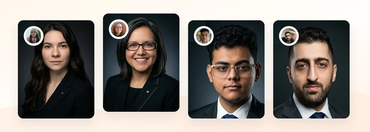
Upload 5-20 everyday photos and get 40-100 polished AI headshots for LinkedIn, resumes, company pages, and executive bios.
15-30 minute delivery • Full commercial rights • One-time payment
Get My Headshots →How to Size and Crop Your Banner Correctly

Great ideas fall apart when the crop is wrong. Before you upload, get the dimensions and the safe zone right.
The target size is 1584 x 396 pixels. Design at that ratio so LinkedIn does not stretch or compress your image. If you want a fast, accurate crop, run your image through the LinkedIn banner size tool to lock the 1584 x 396 dimensions before you export.
The trickier part is the safe zone. Your profile photo overlaps the lower-left corner of the banner, and your name, headline, and location sit across the bottom third on many layouts. On mobile, LinkedIn crops the banner tighter, so the far edges can vanish.
Follow these placement rules:
- Keep text and logos in the upper-right two-thirds of the banner, away from the lower-left corner.
- Leave breathing room at the bottom so your name and headline do not collide with your message.
- Center your most important element horizontally so mobile cropping does not cut it off.
- Test the layout on your phone after uploading, since that is how most people will see it.
Here is a quick reference for banner planning:
| Element | Recommendation |
|---|---|
| Dimensions | 1584 x 396 pixels (4:1) |
| File type | JPG, PNG, or GIF under 8MB |
| Safe text area | Upper-right two-thirds |
| Avoid | Lower-left corner (profile photo overlap) |
| Mobile check | Center key content, preview on phone |
Get these basics right and even a simple color banner will look intentional and clean.
Best Practices for a Standout Banner
The best LinkedIn cover photo ideas share a few habits. Use them to make any concept above look polished.
Keep it simple. One message, one focal point. A banner is not a brochure. If a viewer cannot understand it in two seconds, it is too busy.
Match your headshot. Your banner and profile photo should feel like a set. Shared colors, consistent lighting, and a similar level of formality make the whole profile look coordinated. If you are refreshing both at once, a consistent LinkedIn headshot approach keeps the tone aligned.
Prioritize contrast and readability. Dark text on a light background, or light text on a dark background, reads far better than low-contrast overlays. Assume viewers are scanning on a small screen.
Coordinate with your background choice. The same principles that make a headshot backdrop work apply here. If you want deeper guidance on framing your profile photo, review the LinkedIn profile picture background options and echo that palette in your banner.
Use licensed or original imagery. Only use photos and logos you have the right to display. For company assets, confirm you are allowed to use them on a personal profile.
Refresh it periodically. Update the banner when your role, offer, or focus changes so it never contradicts your current headline.
Leave white space. Empty space is not wasted space. It gives your message room and makes the banner feel modern rather than crowded.
Common Mistakes to Avoid
Most weak banners fail for predictable reasons. Watch for these before you publish.
- Text hidden behind your profile photo. This is the most common error. Anything placed in the lower-left corner gets covered by your headshot. Keep words and faces clear of that zone.
- Ignoring the mobile crop. A banner that looks perfect on desktop can lose its edges on a phone. Always preview on mobile.
- Blurry or stretched images. Uploading a low-resolution file or the wrong ratio produces a pixelated result. Start at 1584 x 396.
- Too much text. Full paragraphs, multiple taglines, and dense lists are unreadable at banner size. Limit yourself to one short line.
- Clashing with your headshot. A neon banner behind a formal headshot looks disjointed. Coordinate the two.
- Generic stock photos. A random handshake or skyline with no connection to your work adds noise, not meaning.
- Leaving the default blue. The plain template is the biggest missed opportunity of all. Even a single brand color beats it.
Create Professional Headshots in Minutes
Upload 5-20 everyday photos and get 40-100 polished AI headshots that pair perfectly with your new LinkedIn banner.
15-30 minute delivery • Full commercial rights • One-time payment
Get My Headshots →Final Thoughts
Your LinkedIn banner is prime real estate that most profiles leave blank. With the 30 LinkedIn banner ideas above, you can pick a concept that fits your profession, size it correctly at 1584 x 396 pixels, and keep your message out of the profile-photo overlap so nothing important gets cropped.
The formula is simple: choose one clear idea, respect the safe zone, and coordinate the banner with a headshot that shares the same tone. Do that, and your profile will read as intentional and current the moment someone lands on it.
Start by preparing a few clean source photos and a single-line message you want your banner to carry. Once your headshot and banner match, your whole profile earns the extra seconds of attention that lead to real conversations. When you are ready to refresh the headshot side, the CTA below shows how to create a polished set in minutes.
Frequently Asked Questions
Quick answers to the most common questions about LinkedIn banner ideas and sizing.
What is the ideal LinkedIn banner size?
LinkedIn recommends a background image of 1584 x 396 pixels, which is roughly a 4:1 ratio. Design at that exact size to avoid stretching or blurring, and keep your file under 8MB in JPG, PNG, or GIF format.
Where should I place text on my LinkedIn banner?
Keep text in the upper-right two-thirds of the banner. Your profile photo covers the lower-left corner, and your name and headline sit across the bottom, so anything placed there can be hidden or cropped, especially on mobile.
Do I need a designer to create a LinkedIn banner?
No. A single brand color with one short line of text often outperforms a busy design. Free tools let you crop to 1584 x 396 and add simple text, so you can create an effective banner in minutes without design software.
Should my banner match my profile photo?
Yes. A coordinated banner and headshot make your profile look intentional. Share colors, lighting, and formality between the two so they read as a set rather than two unrelated images.
How often should I update my LinkedIn banner?
Update it whenever your role, offer, or focus changes so it stays consistent with your headline. Even without a role change, refreshing it once a year keeps your profile looking active and current.